- Authors
- Name
- Lacuna Strategies
- @LacunaStrategies
First impressions are vital, and for many service businesses, a website's pop-up might just be that first touchpoint. Whether it's a dental clinic offering a free consultation, a landscaping company showcasing seasonal discounts, or a local painter highlighting their portfolio, pop-ups serve a crucial role in lead generation and user engagement. However, there's a fine line between informing visitors and overwhelming them, and crossing it can mean the difference between a new customer and a lost opportunity.
This article aims to navigate you through the intricate maze of using pop-ups effectively. We understand the unique challenges service businesses face, especially in industries like dentistry, landscaping, and painting, where customer trust is paramount. That's why we're here to guide you on crafting pop-ups that not only capture attention but do so with respect for your visitors' experience. So, let's embark on this journey to transform your pop-ups from a potential nuisance to powerful tools for conversion, all without causing a hint of user frustration.
The Different Types of Pop-Ups:
As a small business owner and website development expert, I've seen firsthand how pop-ups on a website can either make or break a user's experience. But before diving into the nitty-gritty of crafting the perfect pop-up, it's essential to understand the different types available and their specific purposes.
- Informational Pop-Ups:
- Definition and Purpose: These pop-ups are designed to provide users with additional information or updates. Think of them as friendly nudges, guiding visitors to explore new features or read the latest blog post.
- When and Where to Use Them: Best used when you have a new announcement or feature update. Place them strategically, so they don't disrupt the user's primary task. For instance, if you run a dental clinic, an informational pop-up could highlight new safety measures implemented in the clinic.
- Real-life Example: A landscaping company recently introduced a new eco-friendly service. They used an informational pop-up on their homepage, briefly explaining the benefits of this service and directing users to a detailed page.
- Promotional Pop-Ups:
- Definition and Purpose: As the name suggests, these pop-ups promote special offers, discounts, or events. They're the digital equivalent of a store's "Sale" sign, grabbing attention and enticing users to take action.
- Best Practices for Crafting Compelling Offers: Ensure the offer is genuinely valuable to the user. For instance, a limited-time discount or an exclusive webinar can be enticing. Always include a clear call-to-action.
- Real-life Example: A painting company offered a 10% discount for bookings made within a specific week. Their promotional pop-up showcased some of their best work, coupled with the discount details, leading to a spike in bookings.
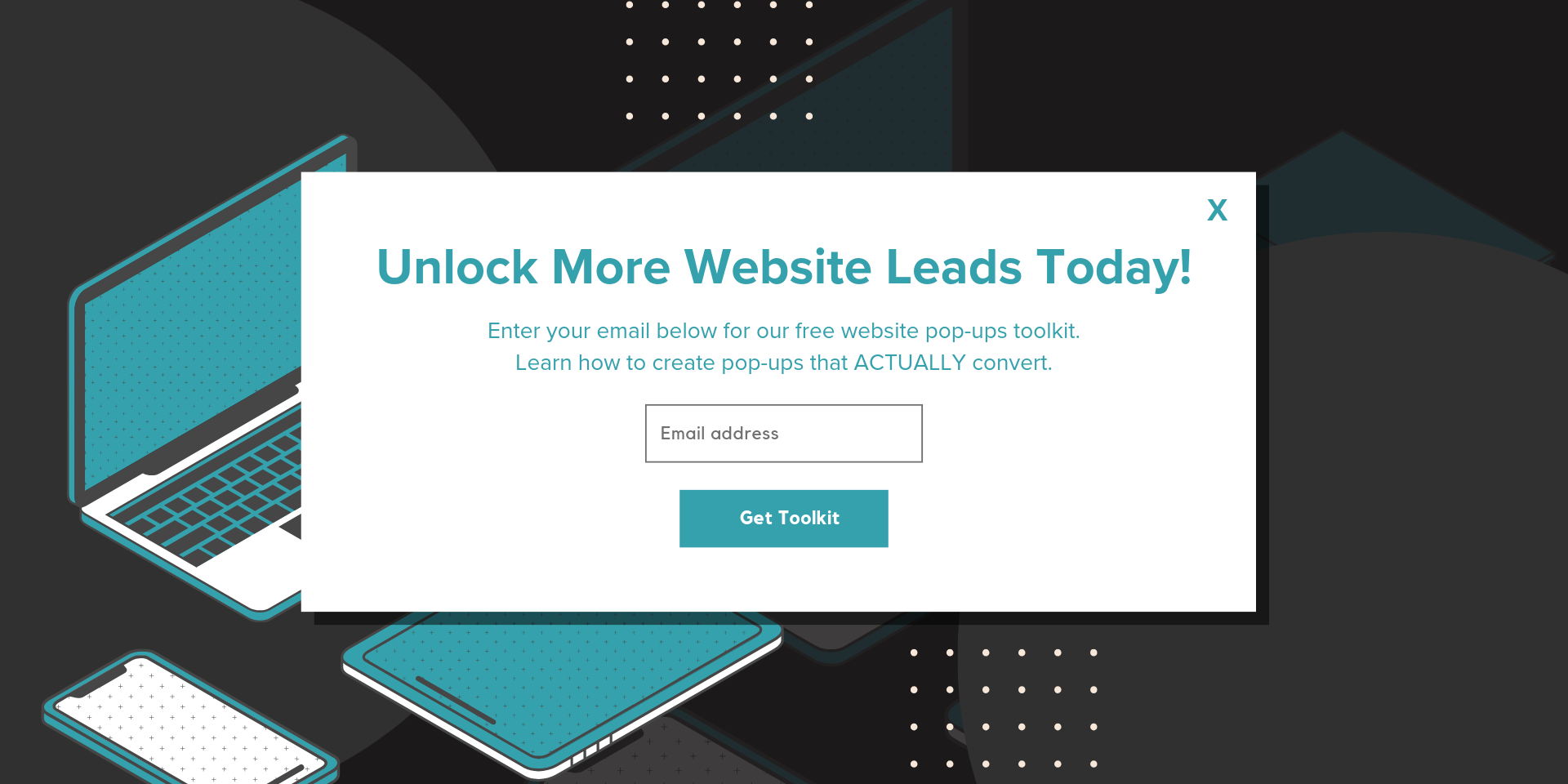
- Newsletter Sign-Up Pop-Ups:
- Importance of Building an Email List: An email list is a direct channel to your audience, allowing you to share updates, offers, and news. It's a long-term investment in building a loyal customer base.
- Tips for Encouraging Sign-Ups: Offer value in exchange for their email, like a free e-book or a discount code. Ensure the sign-up process is quick and straightforward.
- Real-life Example: A dental clinic used a newsletter sign-up pop-up, offering free dental hygiene tips monthly. The pop-up showcased a smiling patient, emphasizing the benefits of regular dental care, leading to a significant increase in sign-ups.
In the service sector, where trust and credibility are paramount, it's crucial to use pop-ups that resonate with your audience's needs and preferences. By understanding the different types of pop-ups and their specific purposes, you can craft messages that genuinely engage and convert.
Mobile Optimization: A Must-Have for Pop-ups
A significant portion of website traffic comes from mobile devices - the majority, at this point. For small business owners in the service sector, ensuring that pop-ups are optimized for mobile is not just a recommendation; it's a necessity.
The Rise of Mobile Browsing:
With the proliferation of smartphones and tablets, more and more customers are accessing websites on the go. Whether they're searching for a local dentist while waiting for a bus or looking up landscaping ideas during a lunch break, mobile browsing has become an integral part of their daily routine.
Navigating the Challenges of Mobile Pop-Ups
- Mobile screens are smaller, which means there's less real estate to work with. Pop-ups that might look great on a desktop can easily overwhelm a mobile screen, hindering the user experience.
- Touchscreen navigation poses its own set of challenges. Buttons need to be larger and more spaced out to prevent accidental clicks.
Crafting Mobile-Friendly Pop-Ups: Key Tips
Here's how you can make your pop-ups more mobile-friendly:
- Keep it Simple: With limited screen space, concise messaging is key.
- Easy-to-Close Pop-Ups: Make sure the 'X' button is large enough to tap easily on a mobile screen.
- Test Extensively: Always preview your pop-ups on different mobile devices to ensure they look good and work as intended.
In the service industry, where many clients might be locals searching on their phones, mobile optimization is crucial. By creating mobile-friendly pop-ups, you enhance user experience and boost your chances of turning a casual browser into a loyal customer.
Mastering Pop-Up Timing and Frequency: A Balancing Act
The effectiveness of pop-ups hinges heavily on their timing and frequency. Striking the right balance is crucial—overdo it, and you risk frustrating your visitors; get it right, and you could see a noticeable boost in conversions.
The Psychology Behind Pop-Up Timing
First impressions matter. Displaying a pop-up immediately upon a visitor's arrival can be off-putting. It's like being approached by a salesperson the moment you enter a store. Give your visitors some time to get acquainted with your website before presenting them with a pop-up.
Timing Your Pop-Ups Right: Some Best Practices
Consider implementing time-based triggers, which display the pop-up after a visitor has spent a certain amount of time on your site. Scroll-based triggers, which activate once a visitor has scrolled through a particular percentage of a page, can also be effective. This approach is particularly useful for service businesses—it ensures the visitor has demonstrated interest in your content before encountering the pop-up.
Avoiding Pop-Up Overkill: The Art of Moderation
When it comes to pop-ups, less is often more. If a visitor closes your pop-up, take it as a sign—they're not interested at that moment. Overloading them with repeated pop-ups can lead to frustration and even drive them away. Consider setting a frequency cap, so if a visitor closes a pop-up, they won't see it again for a defined period.
Case Study: A Service Business That Optimized Pop-Up Timing and Saw Increased Conversions:
A local painting company decided to experiment with their pop-up timing. Initially, they had the pop-up appear immediately upon site entry. After receiving feedback that it was too aggressive, they changed the trigger to display the pop-up after a visitor had scrolled 50% of their homepage. The result? A noticeable increase in newsletter sign-ups and service inquiries.
Timing and frequency are crucial when it comes to pop-ups. By understanding your audience's behavior and preferences, you can craft a strategy that captures their attention without causing annoyance.
Crafting Clear and Concise Pop-up Messaging
In the fast-paced world of pop-ups, you have only a few seconds to capture a visitor's attention. The clarity and brevity of your message could spell the difference between a visitor taking action or dismissing the pop-up.
Your visitors should instantly grasp the purpose of your pop-up. Whether it's promoting an offer, inviting them to subscribe to a newsletter, or introducing a new service, your message should be crystal clear.
Top Tips for Writing Compelling and Concise Messages
- Use action verbs. Instead of "Our newsletter is available for sign-up," try "Sign up for our newsletter!"
- Avoid jargon. Remember, not all your visitors will be familiar with industry-specific terms. Keep it simple and straightforward.
- Highlight the benefits. If you're promoting a discount, emphasize the savings. If it's a newsletter sign-up, mention the valuable insights they'll receive.
- Balance sufficient information vs. brevity. It's a delicate balance—providing enough information to entice the visitor without overwhelming them with text. Use bullet points or brief sentences to effectively communicate your message.
For service businesses, where building trust is crucial, clear messaging can set the tone for future interactions. A pop-up that communicates its intent effectively can pave the way for a visitor to take the next step, be it making an inquiry, booking a service, or simply exploring more of what you have to offer.
Striking the Balance: Design Aesthetics vs Functionality in Pop-ups
While the message of your pop-up is crucial, the design can't be overlooked. A beautifully designed pop-up that aligns with your brand can enhance the user experience, while a poorly designed one can detract from it. However, it's essential to strike a balance between aesthetics and functionality.
- The Role of Design in Pop-Up Effectiveness
- A well-designed pop-up can grab attention and make your message stand out. Think of it as the window display of a store – it needs to be enticing enough to draw people in.
- Importance of Intuitive Design That Doesn't Hinder User Experience
- While it's tempting to go all out with design elements, it's essential to ensure that the pop-up remains user-friendly. Elements should be easily clickable, and the pop-up shouldn't obstruct crucial parts of your website.
- Tips for Achieving a Balance Between Aesthetics and Functionality
- Use consistent branding. Ensure that the colors, fonts, and images used in the pop-up align with your overall brand identity.
- Prioritize readability. Avoid using overly decorative fonts that might be hard to read, especially on smaller screens.
- Ensure smooth animations. If your pop-up has any animations, they should be smooth and not jarring. A subtle fade-in can be more effective than a sudden pop-up.
Real-Life Example: A Successful Pop-Up Redesign
A local landscaping company revamped their pop-up design to align with their brand colors and imagery. The new design, which showcased vibrant images of well-maintained gardens, saw a higher engagement rate. The clear call-to-action, set against a contrasting color, made it easy for visitors to take the desired action.
In the world of web design, where first impressions matter, the design of your pop-up can play a pivotal role in its effectiveness. By ensuring that it's both aesthetically pleasing and functional, you can create a pop-up that not only looks good but also serves its purpose effectively.
Website Accessibility: a Crucial Aspect of Pop-up Design
Ensuring that your website and its elements, including pop-ups, are accessible to all users is not just a best practice - it's a responsibility. Web accessibility ensures that people with disabilities can perceive, understand, navigate, and interact with the web effectively.
- Understanding Web Accessibility:
- Web accessibility means that websites, tools, and technologies are designed and developed so that people with disabilities can use them. This is especially crucial for pop-ups, which can sometimes pose challenges for users with certain disabilities.
- Keyboard Navigation:
- Some users rely solely on keyboards to navigate websites. Ensure that your pop-ups can be accessed, navigated, and closed using keyboard inputs alone.
- Focus management is crucial. When a pop-up appears, the keyboard focus should shift to it, allowing users to interact with it immediately.
- Screen Reader Compatibility:
- Screen readers are essential tools for visually impaired users. Ensure that your pop-up content is structured in a way that screen readers can interpret and read out correctly.
- Utilize ARIA (Accessible Rich Internet Applications) roles and attributes to enhance the experience for screen reader users.
- Contrast, Visibility, and Color Usage:
- Ensure that the text and background of your pop-ups have sufficient contrast, making it readable for users with visual impairments.
- Avoid using color alone to convey information. For instance, don't rely solely on a red color to indicate an error; accompany it with a clear message.
- Predictability and Non-Disruptive Behavior:
- Pop-ups should not disrupt the user experience. Ensure they appear in predictable ways and don't change the current state of the webpage unexpectedly.
- Clear Closing Mechanisms:
- The 'close' or 'dismiss' button on your pop-ups should be easily identifiable and accessible. Consider adding a textual description like "Close pop-up" to make it clear for all users.
- Real-Life Example: A Commitment to Inclusivity
- A local dental clinic, aiming to be inclusive, revamped their website pop-ups to be fully accessible. They ensured keyboard navigation, high contrast, and screen reader compatibility. As a result, they received positive feedback from patients who appreciated the clinic's commitment to inclusivity.
Web accessibility is not just about compliance; it's about ensuring that all users, regardless of their abilities, can access and benefit from your content. By making your pop-ups accessible, you're taking a step towards creating a more inclusive digital world.
Real-Life Examples and Case Studies:
Learning from real-life scenarios can provide invaluable insights. By examining how other service businesses have effectively utilized pop-ups, we can glean best practices and avoid potential pitfalls.
Case Study: A Local Painting Company's Pop-Up Strategy
Consider a local painting company that recently launched a promotional pop-up on their website. The pop-up, which offered a limited-time discount on exterior painting services, was strategically timed to appear when users browsed their portfolio page.
- Analysis of Their Strategy
- The painting company ensured that the pop-up was relevant* to the page content, enhancing the user experience rather than disrupting it.
- They used clear and concise messaging, highlighting the benefits of the offer.
- The design of the pop-up was consistent with the company's branding, with a visually appealing image of a freshly painted home.
- Design Choices and Results:
- The pop-up featured a simple design with a clear call-to-action button.
- It was also mobile-optimized, ensuring a seamless experience for users on all devices.
- As a result of this strategy, the painting company saw a significant increase in inquiries and bookings for their exterior painting services.
- Key Takeaways and Lessons Learned:
- Relevance is crucial. Ensure that your pop-up aligns with the content of the page it appears on.
- Clear messaging, combined with a compelling offer, can drive conversions.
- Consistency in design and branding enhances user trust and engagement.
By examining real-life examples, we can better understand the nuances of effective pop-up strategies. These insights can guide us in crafting our own pop-up campaigns, ensuring that we maximize conversions while maintaining a positive user experience.
Conclusion:
Pop-ups, when used effectively, can be a powerful tool for service businesses to engage visitors and drive conversions. However, it's essential to strike a balance to ensure that these pop-ups enhance the user experience rather than detract from it.
For service businesses, especially those in sectors similar to dentistry, landscaping, and painting, understanding the nuances of pop-up design, timing, and messaging is crucial. By ensuring that our pop-ups are mobile-optimized, accessible to all users, and crafted with clear and concise messaging, we can create a positive impact on our website's performance.
Moreover, real-life examples and case studies provide invaluable insights, helping us learn from the successes and challenges faced by other businesses. As we've seen, relevance, clear messaging, and consistent branding are key components of an effective pop-up strategy.
In conclusion, while pop-ups can sometimes have a negative reputation, when used thoughtfully and strategically, they can be a valuable asset for service businesses. It's all about understanding our audience, crafting our message, and ensuring that our pop-ups align with our overall website goals and user experience.
To all the small business owners out there, we encourage you to experiment, iterate, and find the pop-up strategy that works best for your unique needs. And remember, it's not just about getting that click or conversion—it's about building lasting relationships with your visitors.
FAQs: Frequently Asked Questions about Pop-Ups
In our journey to understand the effective use of pop-ups, several common questions arise. Here, we address some of the most frequently asked questions to provide clarity and guidance.
-
Q: How often should I display a pop-up to a single visitor?
- A: It's essential to strike a balance. Overwhelming visitors with frequent pop-ups can be counterproductive. Consider setting a limit, such as showing a specific pop-up once every few days or weeks to a single visitor.
-
Q: Are pop-ups mobile-friendly?
- A: Pop-ups can be mobile-friendly if designed correctly. Ensure that your pop-ups are responsive, easy to close, and don't disrupt the mobile browsing experience.
-
Q: How can I ensure that my pop-ups are accessible to all users, including those with disabilities?
- A: Focus on web accessibility guidelines. Ensure keyboard navigation, screen reader compatibility, and sufficient contrast. Additionally, avoid unexpected behaviors and ensure clear closing mechanisms.
-
Q: Do pop-ups affect SEO?
- A: Google and other search engines prioritize user experience. If pop-ups are intrusive and hinder the user experience, especially on mobile devices, it can negatively impact SEO rankings. Ensure that your pop-ups enhance, not detract from, the user experience.
-
Q: Can I A/B test different pop-up designs and messages?
- A: Absolutely! A/B testing allows you to compare different versions of a pop-up to determine which one performs better. This can provide valuable insights into what resonates most with your audience.
-
Q: What's the ideal size for a pop-up?
- A: There's no one-size-fits-all answer. The ideal size depends on your content and design. However, ensure that the pop-up doesn't cover the entire screen, especially on mobile devices, and that it's easy for users to close or navigate away.
Remember, while these answers provide general guidance, it's essential to understand your audience and tailor your pop-up strategy to their preferences and needs.